
Introduction
In today's digital landscape, where mobile devices dominate internet usage, adopting a mobile-first mindset while designing websites and applications is crucial. This approach prioritizes the needs of mobile users, ensuring a seamless experience across devices. In this blog post, we will explore the key principles of mobile-first design, focusing on creating interfaces that cater to thumbs rather than mice.
What is Mobile-First Design?
Mobile-first design is a design philosophy that emphasizes creating user experiences for mobile devices before considering larger screens. This approach recognizes that mobile users have different needs and behaviors compared to desktop users, and it aims to provide a tailored experience that meets those needs.
Traditionally, web design has focused on desktop users, with mobile design being an afterthought. However, as mobile devices have become the primary means of accessing the internet for many users, this approach is no longer sufficient. Mobile-first design shifts the focus to mobile users from the outset, ensuring that their needs are prioritized throughout the design process, creating interfaces that are not only visually appealing but also functional and user-friendly.
The Evolution of Mobile Usage
Back in 2015, mobile devices accounted for 31% of global web traffic. Fast forward to 2023, and that number has skyrocketed to over 50%. In some regions, such as Africa, mobile usage is even higher, with over 70% of internet users accessing the web via mobile devices.
The rise of mobile usage has transformed how we interact with technology. Users are no longer confined to their desks; they are on the go, using their devices in various contexts and environments. This shift has created new expectations: fast-loading pages, intuitive navigation, and seamless interactions regardless of location or device. These changing user behaviors have made mobile-first design a necessity for businesses and organizations looking to provide a positive user experience.
Progressive Enhancement VS Graceful Degradation
In the context of mobile-first design, progressive enhancement and graceful degradation are two approaches to consider when creating user experiences. Both aim to ensure that users have a positive experience, regardless of their device or browser capabilities. However, they differ in their approach to building and optimizing web applications. Here's a breakdown of the two concepts:
Progressive Enhancement: This approach focuses on building a solid foundation for mobile users first, ensuring they have access to core features and functionality. Additional enhancements are then added for larger screens and more capable devices. For example, a restaurant website might start with a simple menu, contact information, and location map for mobile users, then add reservation widgets and interactive elements for desktop users.
Graceful Degradation: This approach creates a full-featured experience for desktop users first, then scales back for mobile users. For instance, a web application might have a complex dashboard with multiple columns and interactive elements for desktop users, which is then simplified and features removed for mobile users.
Progressive enhancement aligns with mobile-first principles, ensuring mobile users get a complete, optimized experience rather than a watered-down version of a desktop site. This approach typically results in better performance, as sites start lean and add complexity only when necessary.
What to Consider When Designing for Mobile
When designing for mobile, it's essential to consider the unique challenges and opportunities that come with smaller screens. This includes understanding the limitations of mobile devices, such as screen size, processing power, and connectivity.
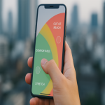
The Thumb Zone
Understanding the "thumb zone" is crucial for mobile design. This refers to the areas of the screen that are easily reachable by a user's thumb when holding a device. Critical navigation elements should be placed within this zone to ensure easy access and usability.
For example, on a typical smartphone held in one hand:
- Easy-to-reach areas: Bottom center and sides
- Harder-to-reach areas: Top corners and center top
- Place critical navigation (back buttons, primary actions) in easy-to-reach zones
- Reserve less frequently used functions for harder-to-reach areas
Touchable Elements
Size guidelines for touchable elements are essential for mobile design. Apple's Human Interface Guidelines recommend a minimum tap target size of 44×44 points, while Google's Material Design suggests 48×48 dp. These larger targets improve accuracy and reduce user frustration, especially for users with motor control difficulties.
Typography
Typography considerations for small screens include font size, line height, and contrast. Text should be legible and easy to read, even on smaller screens. Best practices include:
- Minimum font size of 16px for body text
- Line height of 1.4-1.5 for improved readability
- High contrast between text and background
- Limited use of font variations (weights, styles)
Simplifying Layouts
Content prioritization is crucial for mobile design, as limited screen space requires designers to focus on the most important information. This may involve:
- Using a single-column layout
- Prioritizing content based on user needs
- Employing progressive disclosure (revealing information as needed)
- Using clear, concise calls to action
Page Load Speed
Page load speed is critical for mobile devices. Studies show that 53% of mobile site visits are abandoned if pages take longer than 3 seconds to load. Optimization techniques include:
- Compressing images
- Minifying CSS and JavaScript
- Leveraging browser caching
- Using content delivery networks (CDNs)
Testing on Actual Devices
Testing on actual devices is essential for mobile design, as browser emulators may not accurately represent the user experience. Real device testing helps identify issues with touch interactions, performance, and display variations across different devices and operating systems.
Mobile-Specific Features
Leveraging mobile-specific features can enhance the user experience and provide additional functionality:
- Location services for contextual information
- Camera access for scanning codes or document uploads
- Touch gestures for intuitive navigation
- Device orientation for alternative views
Common Mistakes to Avoid
When designing for mobile, it's essential to avoid common pitfalls that can lead to a poor user experience. Some of these mistakes include:
- Tiny text requiring zooming
- Crowded elements making tapping difficult
- Complex navigation systems
- Non-responsive images
- Requiring excessive typing
- Intrusive pop-ups or interstitials
The Impact of Mobile-First Design on SEO
Mobile-first design is not just about creating a better user experience; it also has significant implications for search engine optimization (SEO). Google has shifted its focus to mobile-first indexing, meaning that the mobile version of your website is now the primary version used for ranking and indexing. This means that if your website is not optimized for mobile users, it may negatively impact your search engine rankings.
Google specifically evaluates mobile-friendliness based on:
- Responsive design implementation
- Page loading speed on mobile devices
- Mobile usability (tap targets, viewport configuration)
- Content parity between mobile and desktop versions
By adopting a mobile-first mindset and focusing on creating a seamless experience for mobile users, you can improve your SEO performance and drive more traffic to your site.
Future Trends in Mobile Design
In the age of foldable screens and gesture navigation, mobile design is constantly evolving. Emerging trends include:
- Adaptive interfaces for foldable devices
- Voice user interfaces complementing touch
- Augmented reality integration
- Gesture-based navigation systems
- Simplified authentication (biometrics)
- Dark mode and battery-efficient designs
- Micro-interactions for enhanced engagement
Designers must stay up-to-date with these trends and technologies to ensure that their interfaces remain relevant and user-friendly.
Conclusion
Adopting a mobile-first mindset is essential for creating user-friendly interfaces that cater to the needs of modern users. By prioritizing mobile design and focusing on the unique challenges and opportunities that come with smaller screens, designers can create seamless experiences that enhance user engagement and conversion rates.
As you implement mobile-first design in your next project, remember these key takeaways:
- Start with mobile users and expand to larger screens
- Design for thumbs by considering touchable areas
- Prioritize content and simplify layouts
- Optimize for performance and speed
- Test on actual devices
- Stay current with emerging mobile technologies
In an increasingly mobile world, embracing this approach isn't just good design practice—it's a competitive necessity for businesses and organizations looking to stay ahead in the digital landscape.

